
UK Fire Safety Signs: Colours, Shapes and Common Failures
Somewhere in your building there is probably a sign that no longer tells the truth. An arrow pointing at what used to be a doorway. An extinguisher sign with nothing underneath it. A fire action notice naming an assembly point that was built on two years ago.
Nobody notices, because signage is the one fire safety control everyone looks at and no one reads. It degrades quietly — a shelf gets moved, a route changes, a bulb fails — and it is finally tested on the one day you would rather it worked.
A note on jurisdiction. Fire safety law is devolved, and the detail varies. The Health and Safety (Safety Signs and Signals) Regulations 1996 apply across Great Britain, with separate equivalent regulations in Northern Ireland. The Regulatory Reform (Fire Safety) Order 2005 applies in England and Wales; Scotland operates under the Fire (Scotland) Act 2005 and the Fire Safety (Scotland) Regulations 2006; Northern Ireland under the Fire and Rescue Services (Northern Ireland) Order 2006 and the Fire Safety Regulations (Northern Ireland) 2010. The colour and shape principles below apply throughout. The section on residential buildings concerns England only.
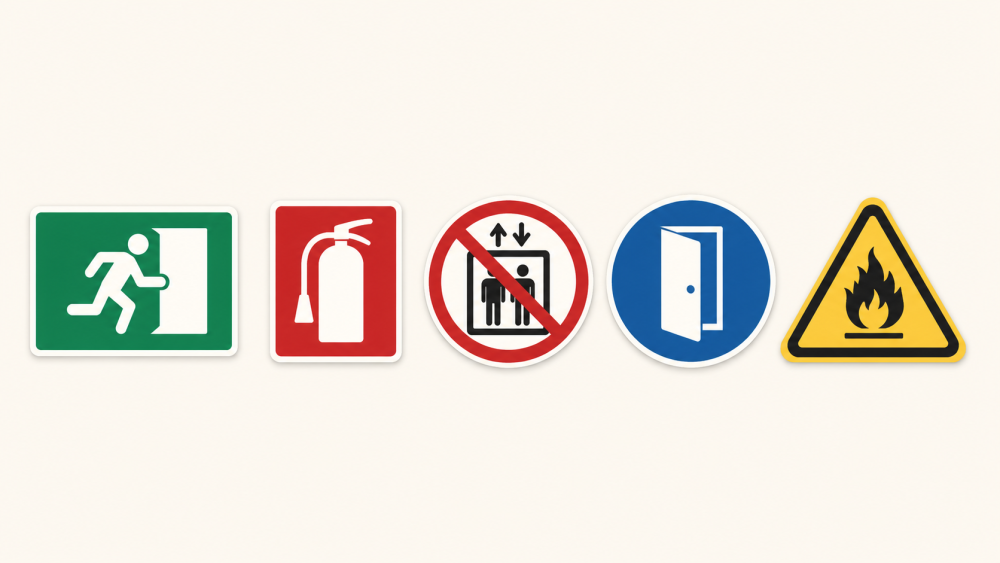

The grammar of safety signs
Safety signs use four main safety colours across five sign categories. The colour indicates the general message, while the shape confirms it.
|
Colour |
Shape |
Means |
Typical examples |
|
Green |
Square or rectangle, white pictogram |
Safe condition — escape routes, first aid and rescue facilities |
Escape route, final exit, assembly point, first aid point |
|
Red |
Square or rectangle, white pictogram |
Firefighting equipment is located here |
Extinguisher, call point, hose reel, fire blanket |
|
Red |
Circle with a diagonal bar |
Prohibition — do not do this |
Do not use lift in event of fire, no smoking |
|
Blue |
Circle, white pictogram |
Mandatory — you must do this |
Fire door keep shut, fire door keep locked |
|
Yellow |
Triangle, black border and pictogram |
Warning — a hazard is present |
Flammable materials, risk of explosion |
The legal requirements establish the essential colours, shapes and meanings of safety signs. BS EN ISO 7010 provides the standardised pictograms now commonly used to meet those requirements — it is a source of recognised symbols rather than the law itself, and HSE guidance allows variations that retain the required intrinsic features.
Two practical consequences follow immediately.
Green and red do different jobs. Green signs identify safe conditions, escape routes and first-aid or rescue facilities — including first-aid equipment. Firefighting equipment, such as extinguishers and fire alarm call points, should be identified using red signs. Marking an extinguisher with a green sign is an error.
A blue circle is an instruction, not information. “Fire door keep shut” is a blue circle because it is telling you to do something. This matters, because blue signs are the ones most often propped open, taped over or ignored.

The green signs do the real work
In an evacuation, escape signage is the only signage most people will consciously use. It deserves disproportionate attention.
Consistency matters more than which family you use
The UK has two families of escape signage in circulation: the older BS 5499 running man and the BS EN ISO 7010 running man. They look similar. They are not identical — the figure, the door graphic and the arrow conventions differ.
Older BS 5499 signs may remain acceptable if they are clear and effective; HSE guidance confirms that existing signage can continue to satisfy the Regulations where it still fulfils its purpose. An older sign does not automatically make a route non-compliant. However, escape-route signage should follow a consistent design scheme throughout the route, because unnecessary changes in symbols or arrow styles may cause hesitation — and hesitation is the thing escape signage exists to eliminate.
If your building has had signs replaced piecemeal over fifteen years, this is worth twenty minutes of your time.
Arrows are the most-misread element on the sign
Arrow direction causes more confusion than any other part of escape signage — including among people who have worked in a building for years. A downward arrow, in particular, is read by some people as “go down” and by others as “proceed forward from here,” which is exactly the kind of ambiguity nobody needs at three in the morning.
The pragmatic answer is not to litigate the standard but to walk the route. Stand at each sign, look where the arrow sends you, and check that a stranger would end up at a final exit. If the arrow makes you pause, it will stop somebody else entirely.
Size the sign to the distance
Sign size should be selected according to its expected viewing distance. A sign suitable for a short corridor may be far too small at the far end of a warehouse or a long escape route — and a sign that cannot be read is not performing its function, however compliant it looks on a purchase order.
BS 5499-4 provides the relevant sizing and viewing-distance guidance, along with recommendations on location, mounting height, lighting and maintenance. Where the calculation matters — large open spaces, long corridors, complex routes — this is a job for competent fire-safety advice rather than a rule of thumb.
Signage must stay visible when the lights fail
Fire exit signs must remain visible under the conditions anticipated during an emergency. Where normal lighting could fail, the fire risk assessment may identify a need for emergency escape lighting to illuminate signs and escape routes. HSE guidance is clear that adequate illumination is required where natural light is poor.
Photoluminescent signs and low-level way-guidance systems can supplement these arrangements, but should not automatically be treated as a replacement for emergency lighting. Photoluminescent material also needs ambient light to charge, so a sign in a permanently dim service corridor may not perform as expected.
The relevant code of practice is BS 5266-1:2025, which came into effect on 31 October 2025 and superseded the withdrawn 2016 edition.
What changed for residential signage in England
This is the part most signage articles have not caught up with, and it matters if you manage flats. Two separate pieces of law are often run together, so it is worth separating them.
The Fire Safety Act 2021 clarified the scope of the Fire Safety Order, confirming that it covers a building’s structure, external walls and flat entrance doors. It did not itself create signage duties.
The Fire Safety (England) Regulations 2022 introduced the specific wayfinding and resident-information requirements:
• Wayfinding signage (Regulation 8). Existing high-rise residential buildings in England that are at least 18 metres high or have at least seven storeys must have wayfinding signage identifying floor levels and flat numbers, visible in low light or smoke conditions. This is aimed squarely at firefighters navigating unfamiliar buildings in poor visibility. Separately, Building Regulations guidance in Approved Document B applies wayfinding recommendations to new multi-occupied residential buildings with storeys more than 11 metres above ground level.
• Resident information (Regulation 4). Responsible persons for buildings containing two or more sets of domestic premises with relevant common parts must display suitable fire safety instructions in a conspicuous location and provide those instructions to residents. They must also provide residents with information about the importance of fire doors.
Note that the two thresholds do different work. The 11-metre figure that circulates widely relates to new-build guidance and to the fire-door checking duties under Regulation 10 — it is not the general threshold for wayfinding signage in existing buildings.
Beyond signage, the Fire Safety (Residential Evacuation Plans) (England) Regulations 2025 came into force on 6 April 2026, introducing residential personal emergency evacuation plans and building-wide emergency evacuation plans for buildings in scope. They fall outside the subject of this article, but if you are reviewing signage in a residential block you should be looking at those duties at the same time.
A twenty-minute walkthrough
Reading about signage achieves less than walking your building. Try this, starting from the point in your premises furthest from an exit:
1. Walk out as a visitor would. Not the route you take by habit — the route the signs tell you to take. Note every point where you had to think.
2. Look up, then look down. Signs mounted at ceiling height disappear in smoke, which rises. Low-level way-guidance is worth considering on long or complex routes.
3. Check what is in front of the signs. Stock, coat racks, pull-up banners and Christmas decorations obscure more signage than vandalism ever has.
4. Check the fire doors. Self-closing fire doors should carry the appropriate “Fire door keep shut” notice on both sides where required. Cupboard, store and service-duct doors kept locked shut generally need “Fire door keep locked” on the outside only, and flat entrance doors are treated differently again under residential guidance.
5. Find the fire action notice at each call point. Does it name the actual assembly point, or does it still say “the car park” after the car park was built on?
6. Check firefighting equipment is identifiable. Equipment should be clearly identifiable, with directional signs provided where it is hidden from direct view. Any identification or instructional sign should match the equipment actually installed.
7. Test the emergency lighting properly. Arrange a controlled test using the designated test switch or key. Do not deliberately darken occupied escape routes without suitable precautions. Emergency escape lighting should receive regular functional testing — monthly functional tests and an annual inspection are the usual recommendation for smaller premises — with periodic inspection by a competent contractor.
Five failures that show up in inspections
• Improvised or text-only signs. A basic “Fire Exit” printout without the correct pictogram, colours, durability and visibility is unlikely to meet the required standard. Signs produced in-house are not unlawful simply because they were produced in-house, but they must satisfy the same design, material, positioning and maintenance requirements as commercially supplied signs.
• Signs that survived a refit. Layouts change; signage often does not. An arrow pointing at a wall that used to be a doorway is worse than no arrow.
• Assembly points nobody can reach. A designated point across a live road, or inside the fire service’s likely approach, fails in practice even if it exists on paper.
• Refuge points with no communication. A refuge area is only meaningful if someone waiting there can summon help and knows help is coming. Signage alone does not make a refuge.
• Signs without training. This is the big one. Signage is a prompt, not a plan. If staff have never walked the route, the sign is a suggestion rather than an instruction.
Signage is the cheapest fire safety control you will ever buy, and the easiest to get quietly wrong. It fails without announcing itself, and the announcement, when it comes, arrives at the worst possible moment.
It is also a supporting control, not a substitute for one. Signs do not reduce the risk, plan the evacuation, or train the people who will have to carry it out. They only prompt.
Half an hour walking your building will tell you more than any amount of reading. Start at the far end, walk out, and note every moment you have to think.
Signage only works when someone is trained to act on it. Our Fire Marshal Awareness course covers evacuation procedure, assembly points and the duties behind the signs.